CASE STUDIES
PRINTSPACE.IE
Case Studies
Printspace.ie
Founded in 2016, PrintSpace creative studio has been providing their clients with innovative solutions in graphic design, branding and print production. However, despite their extensive experience and unique approach to their work, their visual identity did not fully convey their professionalism and modernity.
Author | Bartłomiej Biegun |
|---|---|
Services | Branding, UI Design |
Used Apps | Elementor, Figma, Asana |

Approach
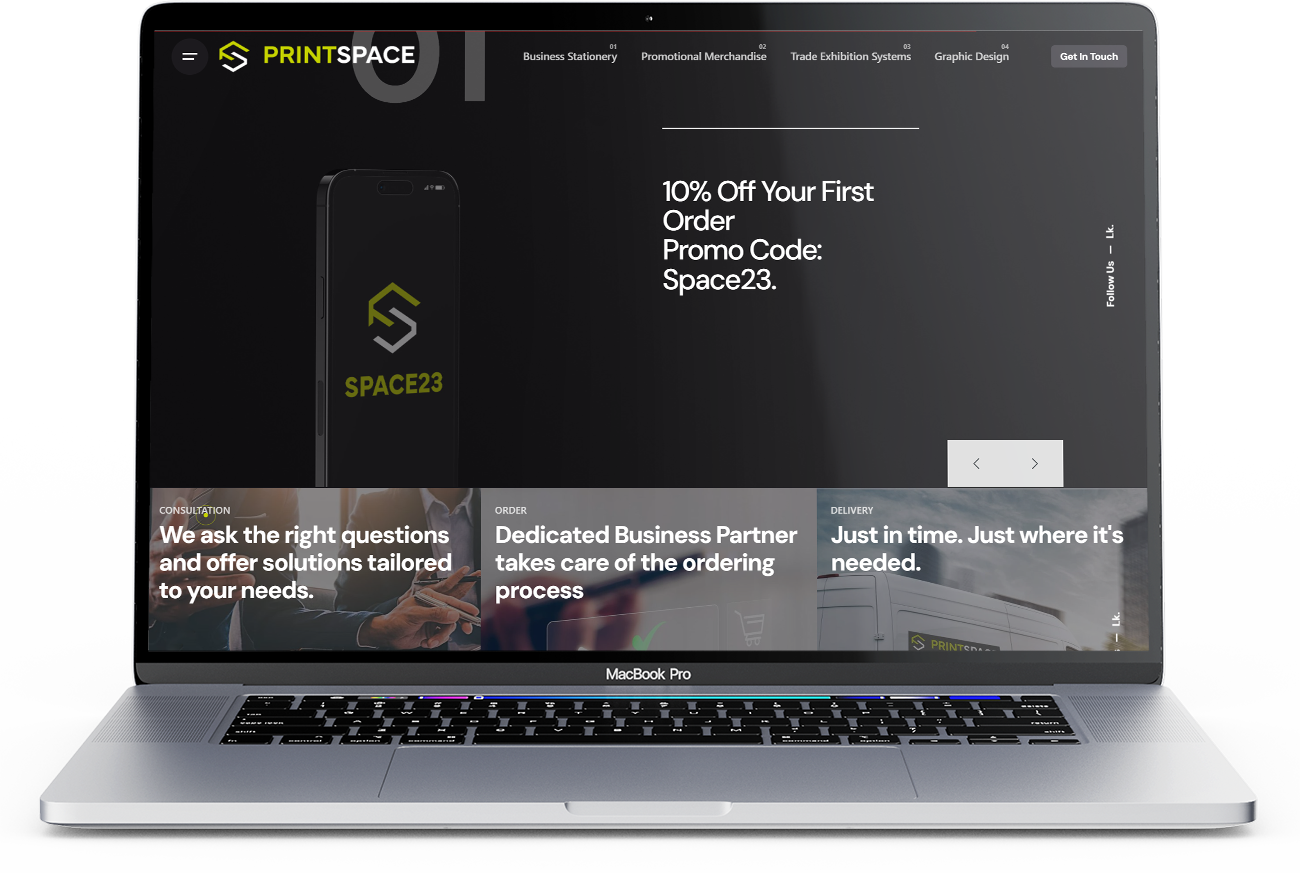
The aim was to create a logo that was simple yet distinctive – a symbol that would be immediately associated with PrintSpace. In the sigil there is a reference to the letters P and S found in the company name. By using expressive shapes, the logo becomes unique and easily recognisable, especially given the dark/black colour scheme of the website.
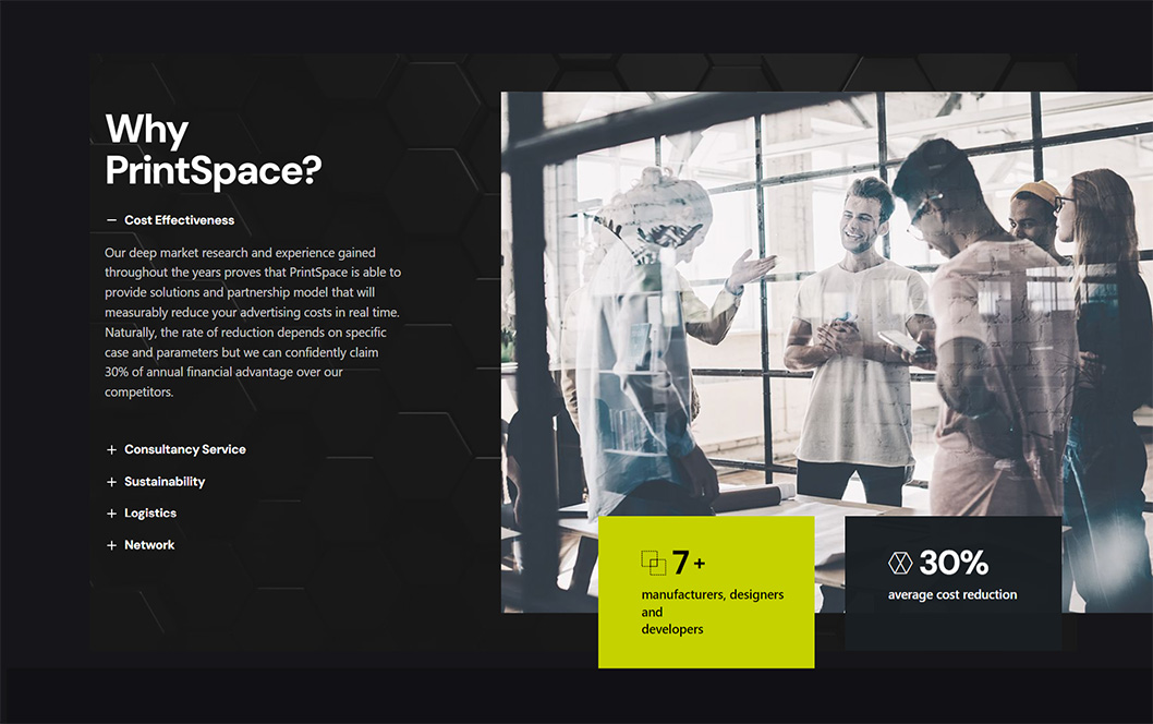
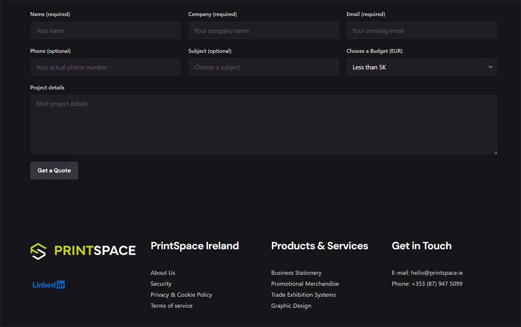
My approach to UX (User Experience) focused on ensuring that the site was intuitive and pleasant to use. Care was taken to ensure that the site loaded quickly and that elements were easy to find and understand. Particular attention was paid to accessibility to ensure that the site was user-friendly for people with various limitations. For example, text is available in bright, readable colours (despite the dark colour scheme of the site) and images have alternative descriptions.
Summary
I was able to create a modern, functional and aesthetically pleasing logo and website that perfectly reflects the PrintSpace brand and conveys its unique values. My solutions highlighted the company’s creativity and professionalism, while providing an exceptional user experience. As a result, the client was extremely satisfied with the final result. The project was a success, resulting in further collaboration on future projects – not just graphic design.


