Kurser LMS aims to revolutionize the e-learning landscape by offering a comprehensive, engaging and interactive online learning environment. The platform is designed for individual audiences who want to develop their knowledge and skills in digital marketing, 3D, UI/UX and other fields.
The project focuses on creating a seamless UI/UX experience that allows users to effectively navigate their learning path.
A visual representation of the user’s progress through courses, enabling learners to easily gauge their achievements and areas requiring attention.
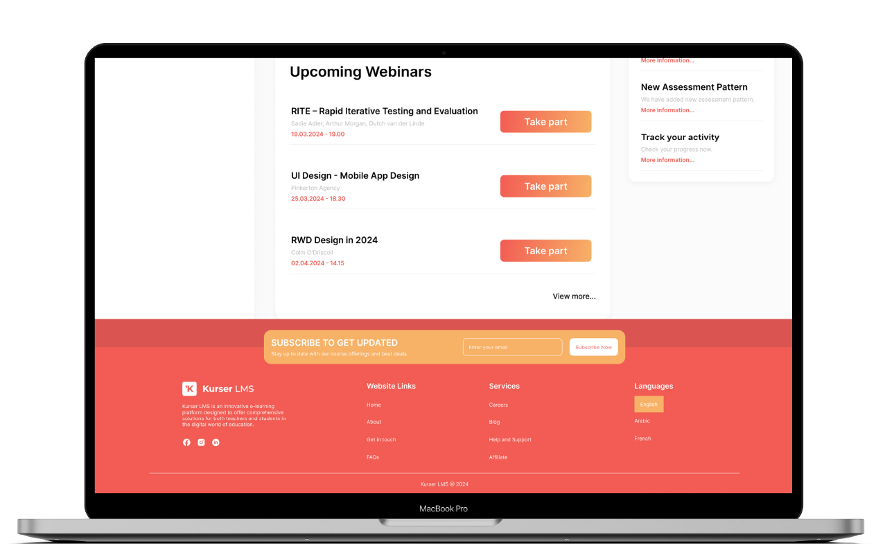
Webinars
A curated list of upcoming live sessions, including detailed descriptions, presenters, and the ability to register or join a webinar with a single click. This feature promotes active learning and community engagement.
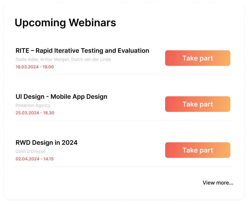
Statistics
The User Section provides a streamlined overview of the total hours spent on courses, allowing learners to track their time investment in their educational journey. This feature offers insights into learning habits and progress, empowering users to manage and optimize their study time effectively.
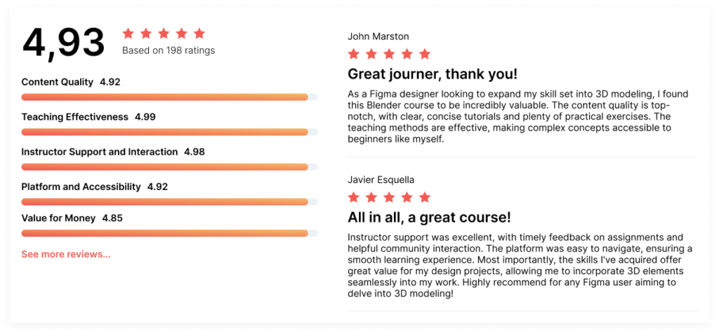
Reviews section
The Reviews Section offers a platform for learners to share their experiences and feedback on courses they’ve completed. This feature not only helps prospective students make informed decisions based on peer reviews but also fosters a sense of community and open dialogue about the learning material.
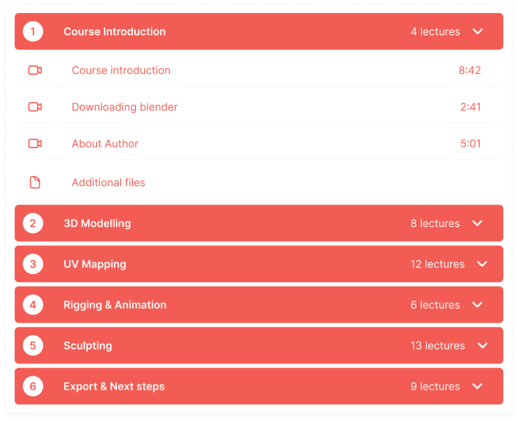
Lessons breakdown
The Lesson Breakdown provides a detailed overview of a course’s structure, offering learners a glimpse into the specific topics covered in each lesson.
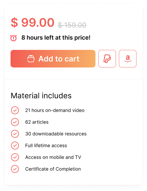
Add to cart
The Add to Cart Course Tab simplifies the process of enrolling in new courses. With a single click, users can add courses of interest to their cart, streamlining the checkout process.
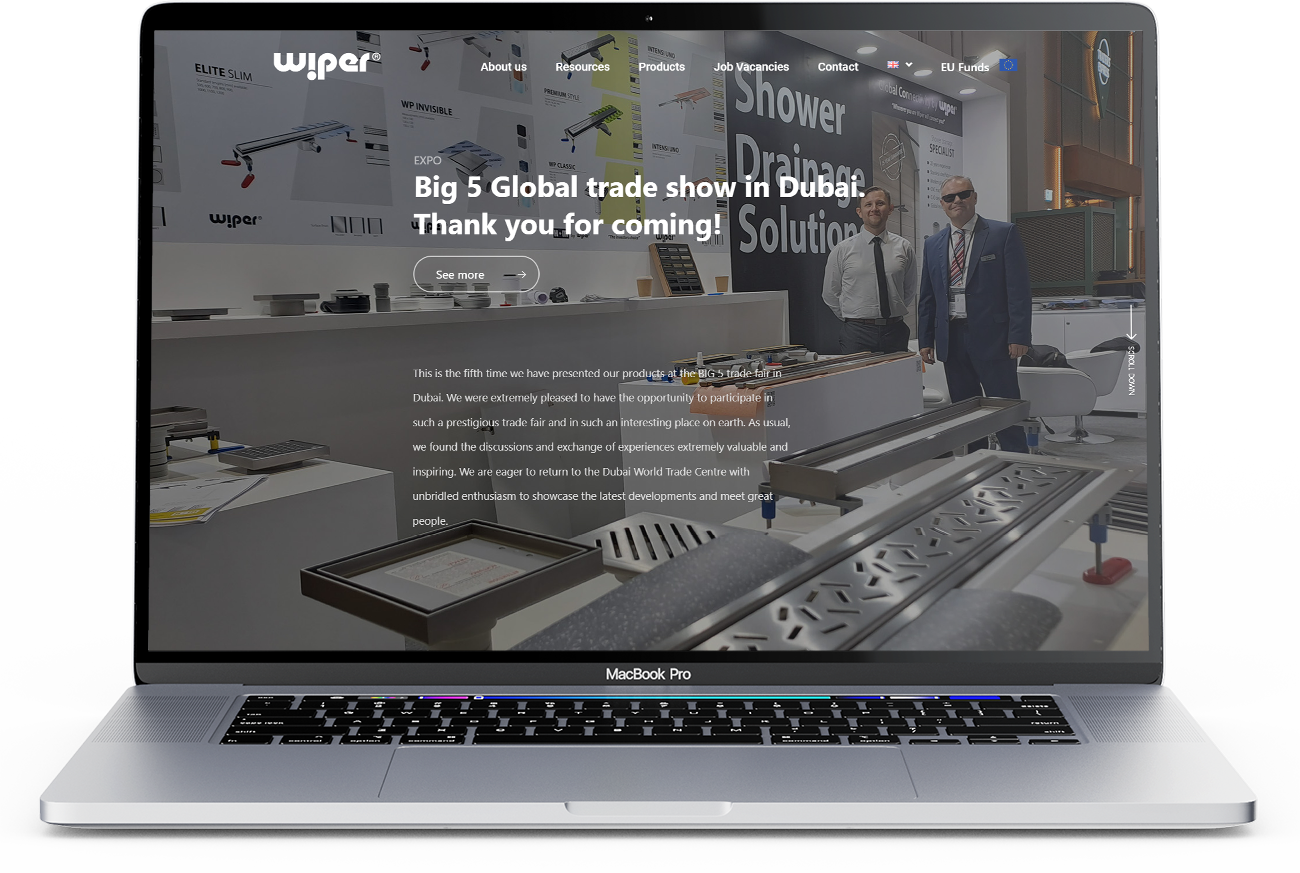
The process started with in-depth market research, analyzing the competitive landscape of shower drainage systems. Wiper’s variety of products and their prestigious recognitions at trade fairs and in consumer quality rankings provided a solid foundation for the redesign.
A key aspect of this project was reorganizing the website’s structure. The aim was to enhance clarity and ease of navigation, making it more intuitive for users to find products and information. Part of this involved developing a comprehensive content strategy. This strategy focused on creating a repository of graphical materials for sales representatives, encompassing everything from product specifications to promotional materials.
Solution
For this project, WordPress was the chosen platform for website development and content management. Graphic design and material creation were handled using Adobe Photoshop and Illustrator. Additionally, Google Analytics was utilized for tracking website performance and user interactions.
The outcome of this project was a complete website redesign that prioritized user-friendly navigation and professional aesthetics. It included an improved information structure that enhanced the user’s ability to find and understand product offerings. Furthermore, a comprehensive repository for sales representatives was established, providing easy access to all necessary marketing and graphical materials.
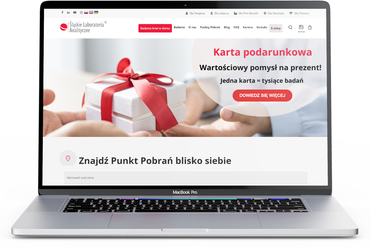
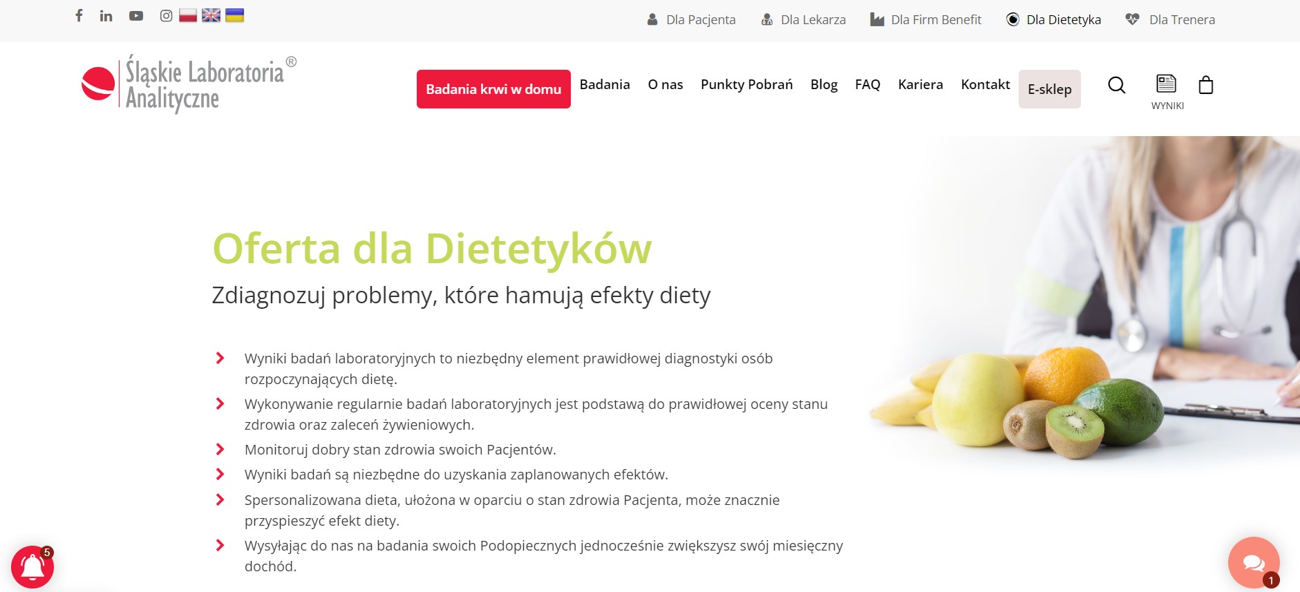
My role involved a comprehensive redesign of the Śląskie Laboratoria Analityczne website. The process began with a thorough initial analysis of the existing website, focusing on the core services of the laboratory. Recognizing their dedication to reliable laboratory testing and a broad spectrum of determinations was key. The laboratory’s extensive experience since 1991 in analyzing a significant portion of Poland’s population, impacting numerous medical diagnoses and health actions, provided a rich backdrop for the redesign.
The primary goal was to enhance the user experience. This meant creating a design that not only looked modern but also facilitated an easy, informative journey for the visitors. Interactive elements such as detailed service descriptions, accessible contact forms, and clear job listings were integrated to encourage user interaction and provide comprehensive information about the laboratory’s services and achievements.
The tools and apps employed in this project included Adobe XD for prototyping and wireframes and Figma for high-fidelity designs. The solution was multifaceted: developing landing pages for promotional offers to improve user engagement and conversion rates; redesigning the website with a modern, user-friendly interface that highlights the laboratory’s services and achievements; and improving website navigation to facilitate easy access to essential information like services, contact details, and career opportunities.
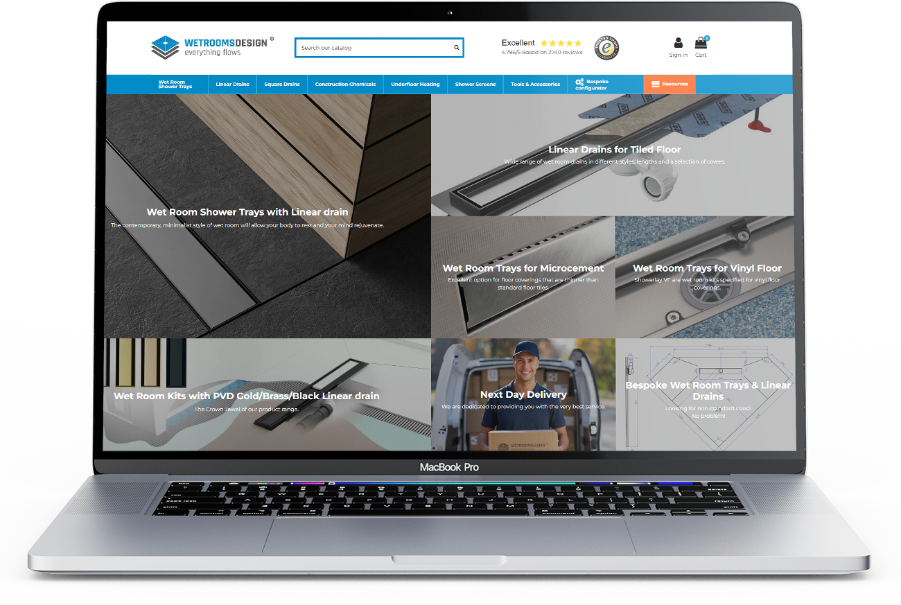
Today’s e-commerce market is a rapidly changing environment where success is determined not only by the quality of the product, but also by the quality of the user experience. When Wetrooms Design approached me, they were looking for an expert to help them improve customer interaction on their website. It’s a challenge I took on with enthusiasm, with the aim of not only improving functionality, but also increasing user satisfaction with the site.
Using the Smartlook tool, a series of heatmaps were created that visualised how users scroll and click through the site. These insights helped to understand which elements of the page were attracting the most attention and which might be overlooked by users. With this data, I was able to identify areas that could benefit from additional emphasis or modifications to improve interaction.
Extensive quantitative research was conducted, which included analysis of Google Analytics data. The focus was on key metrics such as average time spent on the site, rejection rates, conversions, user navigation paths and visit frequency per page. These findings provided a better understanding of how users navigate the site, what content interests them, as well as identifying any areas of difficulty.
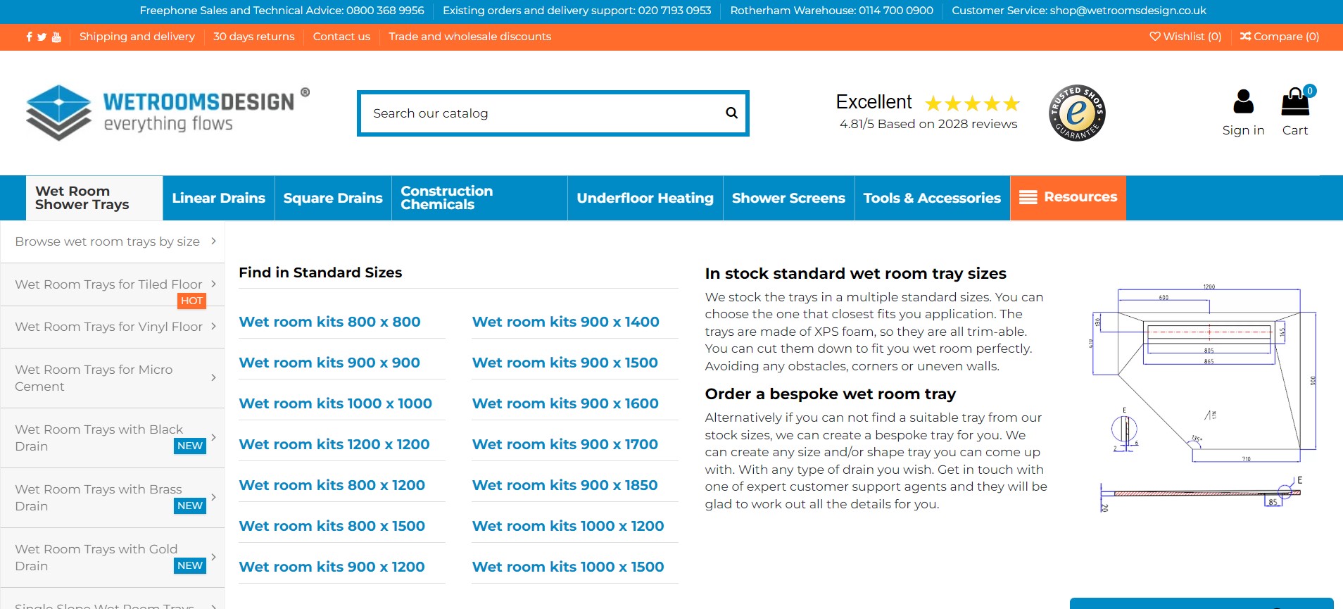
Based on the research, a review of the site’s information architecture was carried out. The aim was to make sure that the information was presented in a way that was intuitive and understandable to users. Several areas were discovered that could benefit from improvements, such as reorganising the navigation menu, improving the product tagging system, and introducing more detailed search filters.
Comprehensive analysis and recommendations allowed Wetrooms Design to make the necessary changes to improve the overall UX on their site. The proposed modifications allowed Wetrooms Design to increase user engagement, improve conversions and overall satisfaction with the site. As a result, the client was extremely satisfied with the professional approach and practical advice, allowing me to continue our fruitful collaboration.
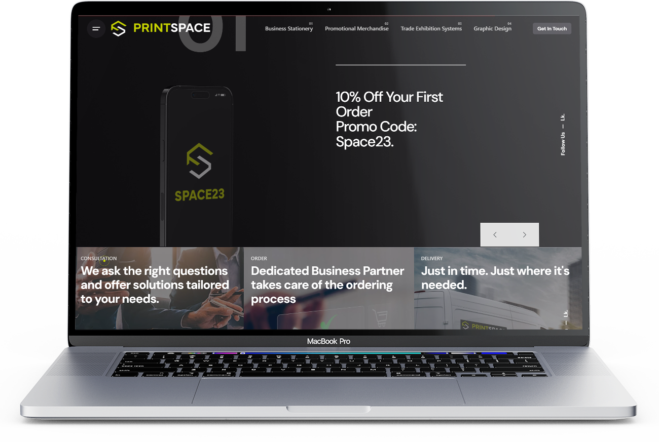
Founded in 2016, PrintSpace creative studio has been providing their clients with innovative solutions in graphic design, branding and print production. However, despite their extensive experience and unique approach to their work, their visual identity did not fully convey their professionalism and modernity.
The aim was to create a logo that was simple yet distinctive – a symbol that would be immediately associated with PrintSpace. In the sigil there is a reference to the letters P and S found in the company name. By using expressive shapes, the logo becomes unique and easily recognisable, especially given the dark/black colour scheme of the website.
My approach to UX (User Experience) focused on ensuring that the site was intuitive and pleasant to use. Care was taken to ensure that the site loaded quickly and that elements were easy to find and understand. Particular attention was paid to accessibility to ensure that the site was user-friendly for people with various limitations. For example, text is available in bright, readable colours (despite the dark colour scheme of the site) and images have alternative descriptions.
Summary
I was able to create a modern, functional and aesthetically pleasing logo and website that perfectly reflects the PrintSpace brand and conveys its unique values. My solutions highlighted the company’s creativity and professionalism, while providing an exceptional user experience. As a result, the client was extremely satisfied with the final result. The project was a success, resulting in further collaboration on future projects – not just graphic design.
Modern medicine allows people to fight many diseases more effectively, but with this also comes the problem of polypharmacy, i.e. taking many different drugs. According to the National Health Service’s 2020 report, more than half of Poles have been ill with at least one lifestyle disease in the past five years. 4.5 million people bought prescriptions for five or more active substances in six months.
Research confirms that the problem is real. More than half (56 per cent) of Poles have suffered or are still suffering from at least one disease of civilisation in the last five years, such as hypertension, atherosclerosis, cancer, diabetes or depression. The number of people continuously taking medication continues to rise. 4.5 million people bought prescriptions for five or more active substances in a six-month period. (NHF report: Everything you need to know about poly-pragmasy, 2020).
Solution
In the course of developing a suitable solution, a series of studies were carried out to explain the problem of the increasing use of medicines by Poles and to provide an insight into the daily process of dealing with illness. Desk research and in-depth interviews (IDI) with respondents were used to find an appropriate solution. The research was conducted in person or using the Google Meet tool.
Features
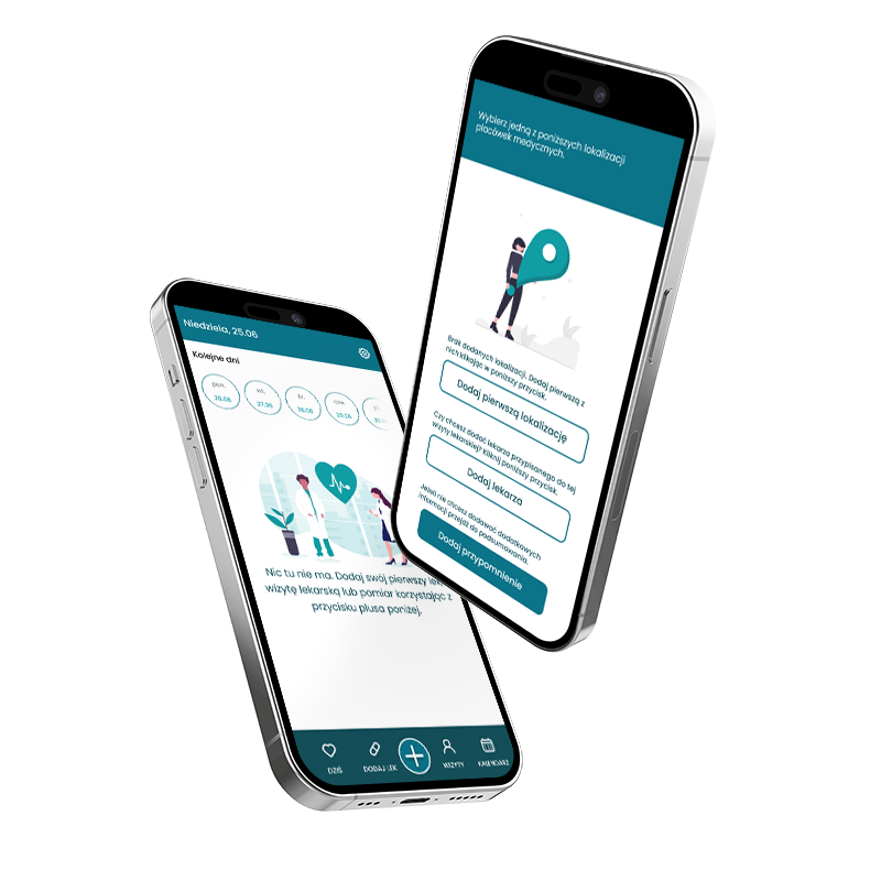
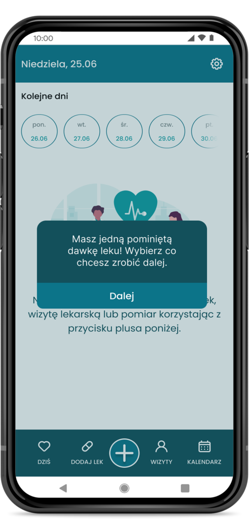
Effective notification system
Notifications that clearly and unambiguously remind users that they need to take their medication at the given dose. Notifications require the user to take an action to confirm that the medication has been taken.
Building positive habits
The easy-to-use functionality of the planner and the view of upcoming medication events make it more user-friendly for patients to start the pharmacotherapy process and develop appropriate habits.
Controlling the quantity of medicines in the medicine cabinet
The user has full control over the number of medicines in their home medicine cabinet. By looking at the status table for each medicine on his phone, he does not have to make a special trip to the medicine drawer.
Medical appointments
Users who are, as it were, often condemned to sitting in doctors’ surgeries can support their therapy with the use of adding medical appointments to the app’s schedule.
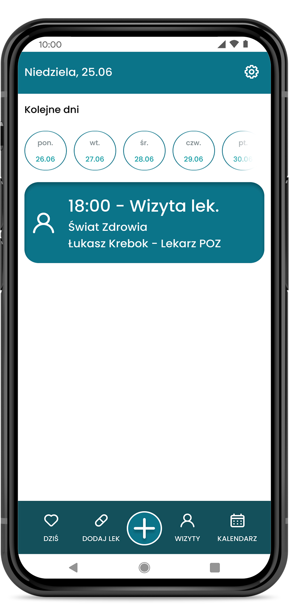
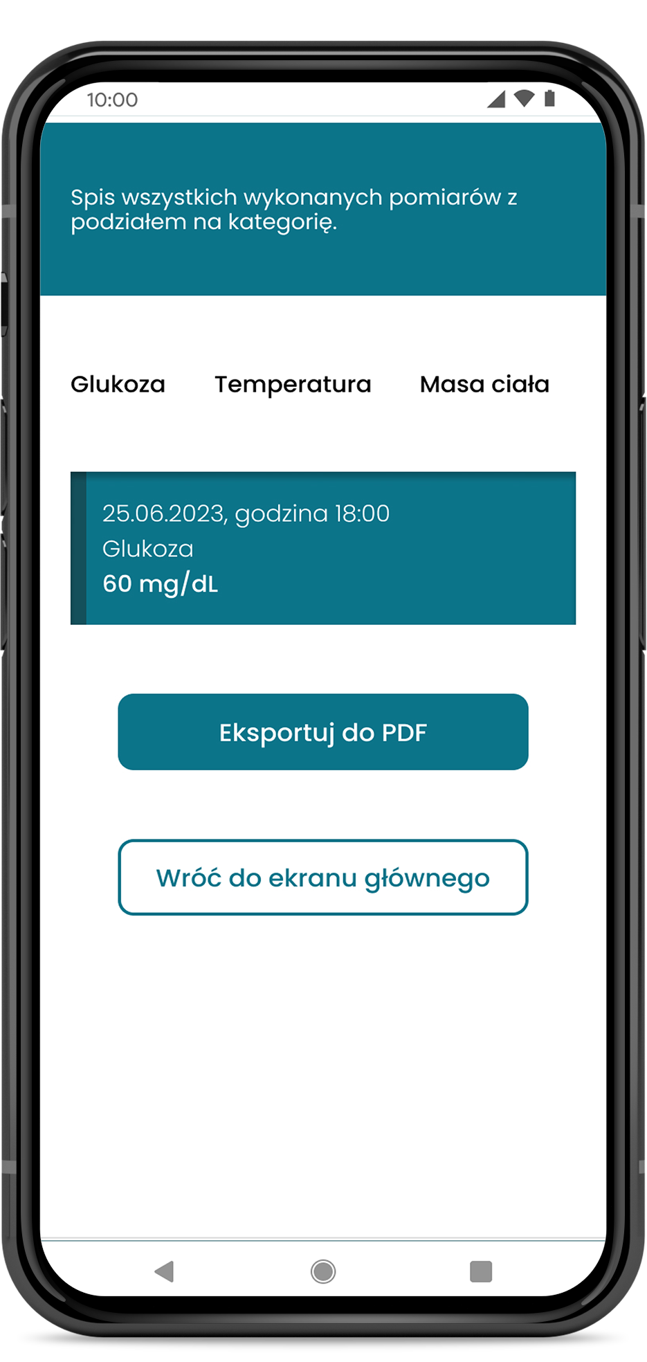
Measurements and statistics
The Pill Please app allows measurements of key indicators to be added to the app. Among the measurements that can be added are glucose, temperature, weight, saturation and pulse and blood pressure.
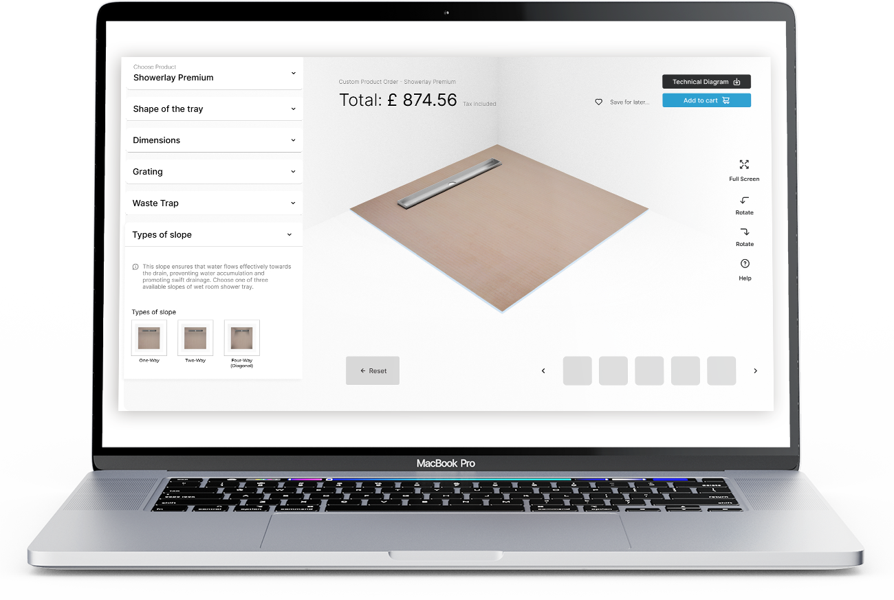
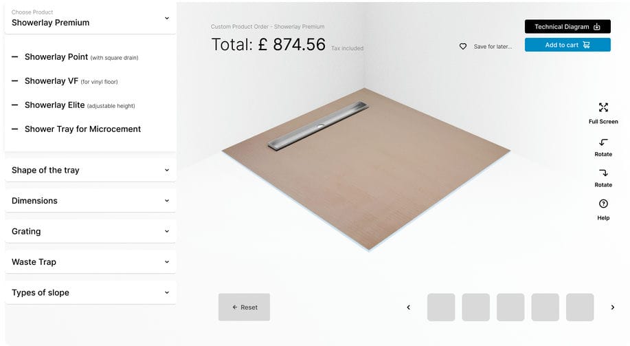
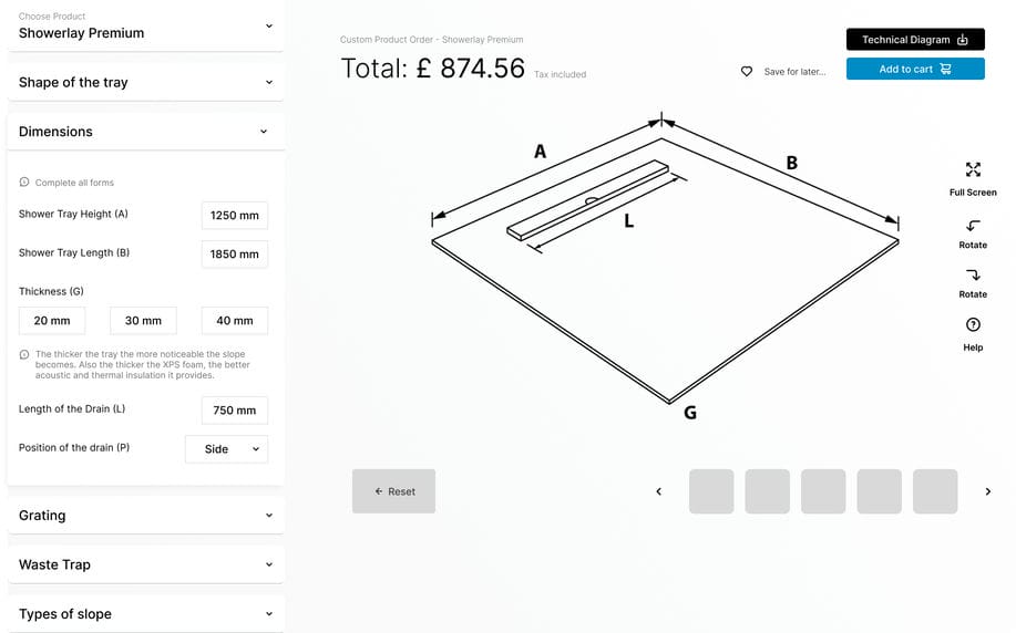
The aim of the project was to create intuitive mock-ups (wireframe’s) of a custom order wizard that would enable Wetroomsdesign’s customers to order custom-sized sub-tiled shower trays in an easy and clear way.
The need to enable the ordering of sub-tiled shower trays with non-standard dimensions. The challenge was to ensure that the tool would be intuitive and accessible to users of different age ranges, while at the same time allowing all key product information to be specified accurately.
Solution
Creation of modern mockups (wireframes) for the custom order wizard. The design is based on minimalism and intuitive elements, so that the user understands at a glance exactly how to use the tool. Once the wizard process is complete, the user has the option to go on to finalise the order or generate a PDF with the information provided.
In the implementation of the wizard project for Wetroomsdesign, the activities were characterised by a deep understanding of the client’s needs, an analytical approach to research and the skilful use of interface design tools. A key part of our process was the creation of structural sketches (wireframes), which allowed us to visualise ideas, plan user interactions and test different concepts.
My approach emphasised the importance of the wireframing stage as a communication, planning and visualisation tool. Ultimately, it became a guarantee for a smooth execution and implementation of the project that brought satisfaction to both us and our client, Wetroomsdesign.